A Digital Universe for Coffee Lovers
If you ever visit the Apple flagship store in NYC, Adobe's EMEA headquarters in London, or L'Oréal's main office in Paris and ask for a cup of coffee – the brewing will be by Scanomat's high-end coffee machine TopBrewer. Dwarf was entrusted with the task of creating a new digital platform to rebrand and accommodate Scanomat's 32 worldwide partners.
The Task
Some time back in the last century (1981), the CEO of Scanomat Kim Vibe-Petersen designed the world's first fully automatic cappuccino machine. Since then, Scanomat has been known for its innovative solutions. Today, the flagship product - the revolutionary bean-to-coffee machine, TopBrewer - is changing the coffee experience and is sold all over the world. Scanomat needed a new website to service their many partners worldwide in a scenario where different variations of product ranges could be accommodated and where the cloud-based digital services surrounding the coffee machines could be unified and promoted under the Scanomat brand.
In Denmark and Scandinavia Scanomat is a well-known and celebrated brand. But as Scanomat developed the revolutionary TopBrewer machine, the product brand itself overtook the bigger picture as the machine went out onto markets around the world. Consequently, partners and customers often had the notion that TopBrewer was the actual brand.
Next to the machines, there is another product and brand that came into being. Amokka is the name of Scanomat's sustainable coffee brand. Originally perhaps more of a con amore coffee project – but today a fully integrated part of the business, where often an Amokka subscription comes with a TopBrewer sale. To gain greater visibility and bang for the buck, brand communication was tightened up so that brand, brewer, and coffee communication are the same across existing and emerging markets, so new markets inherit some of the brand strength from the markets where Scanomat is well established.
The Solution
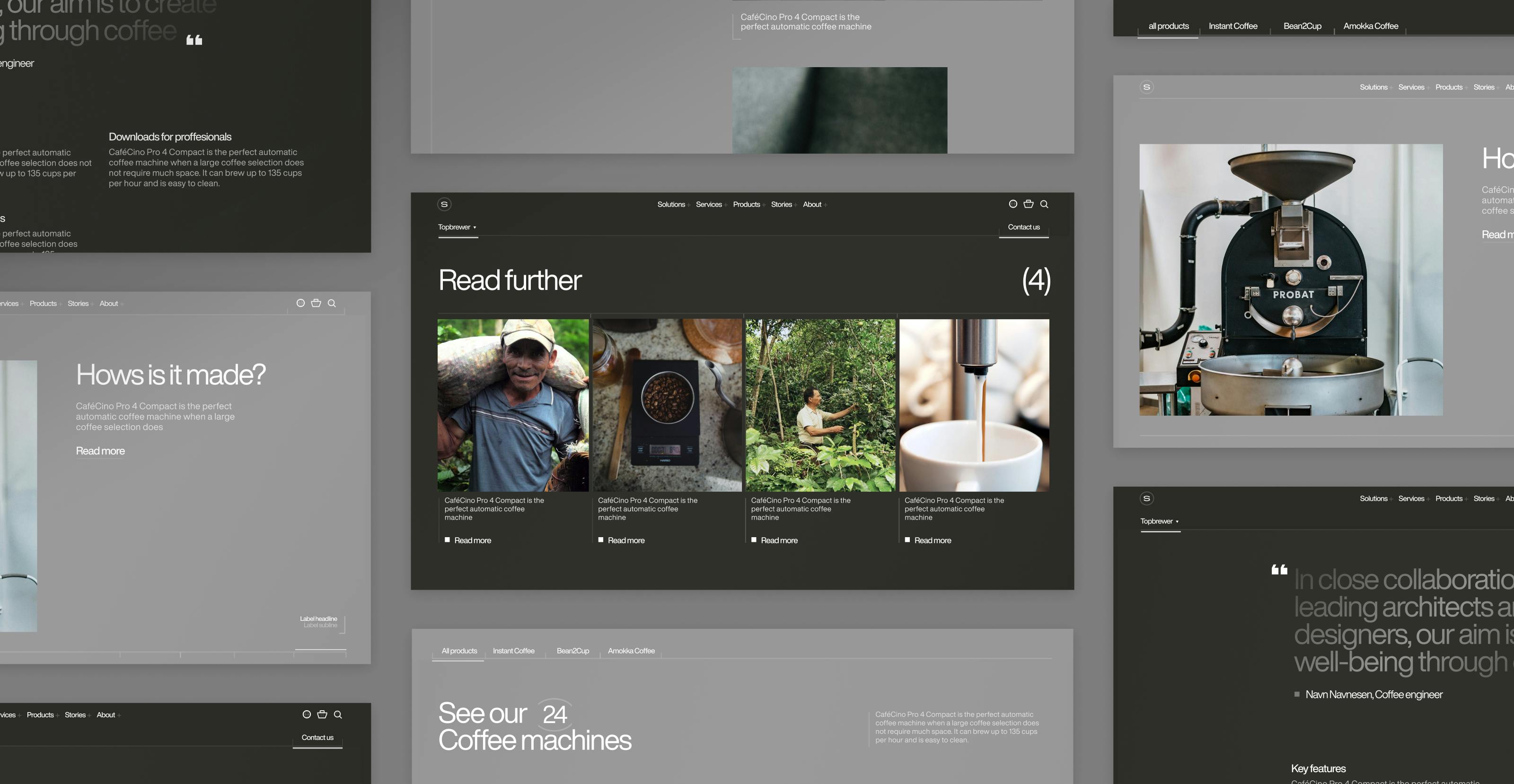
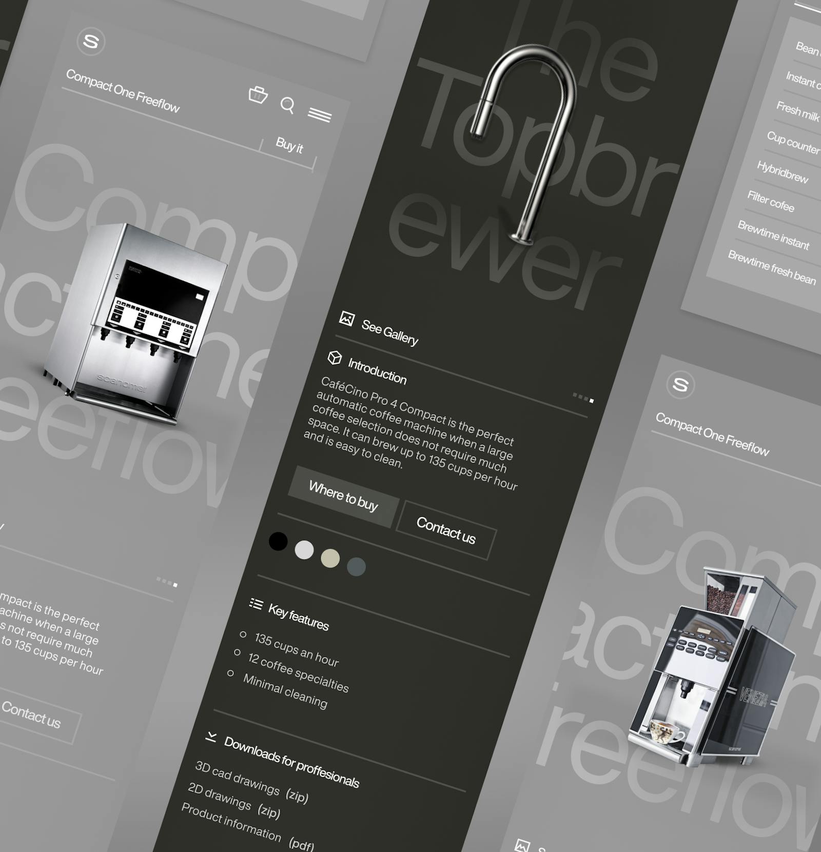
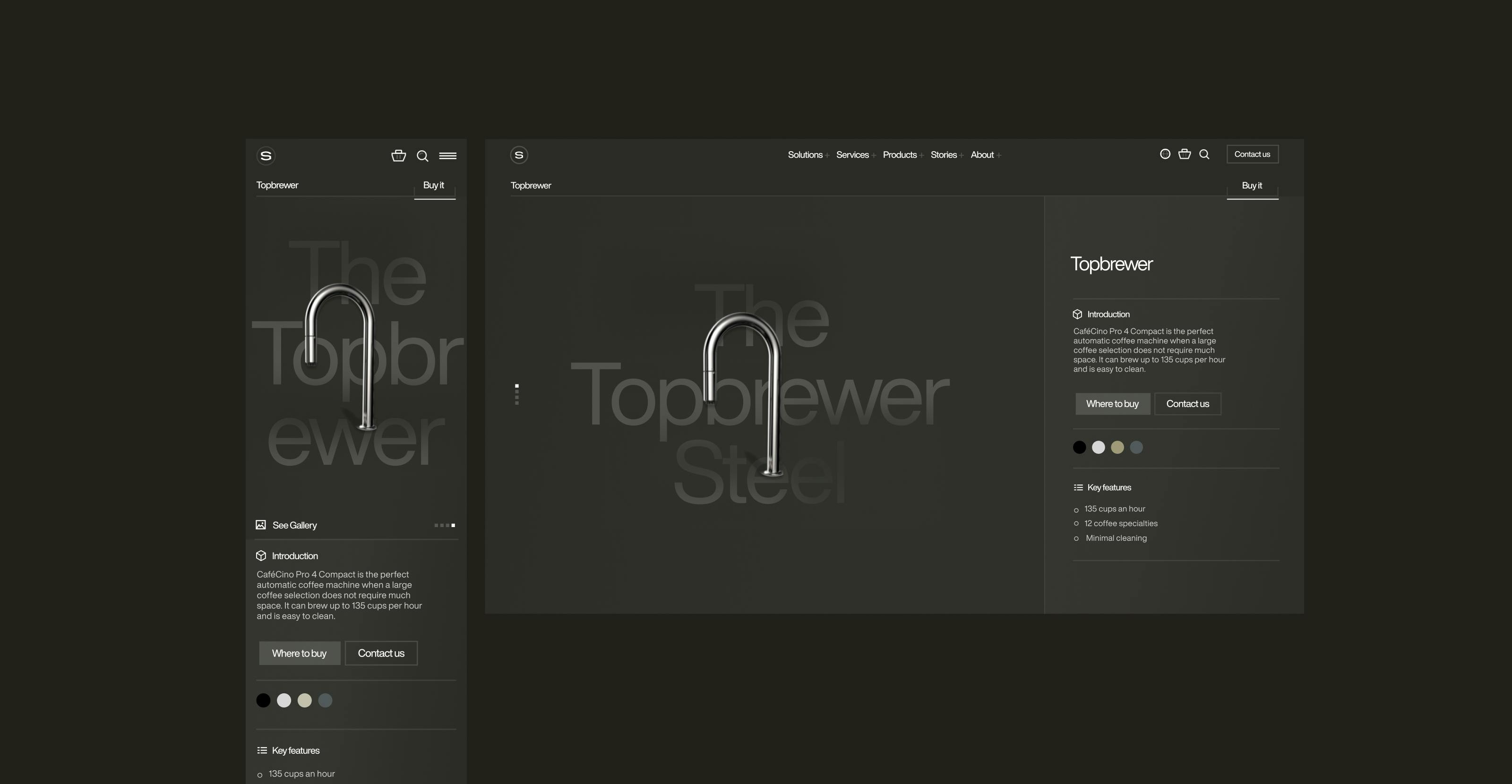
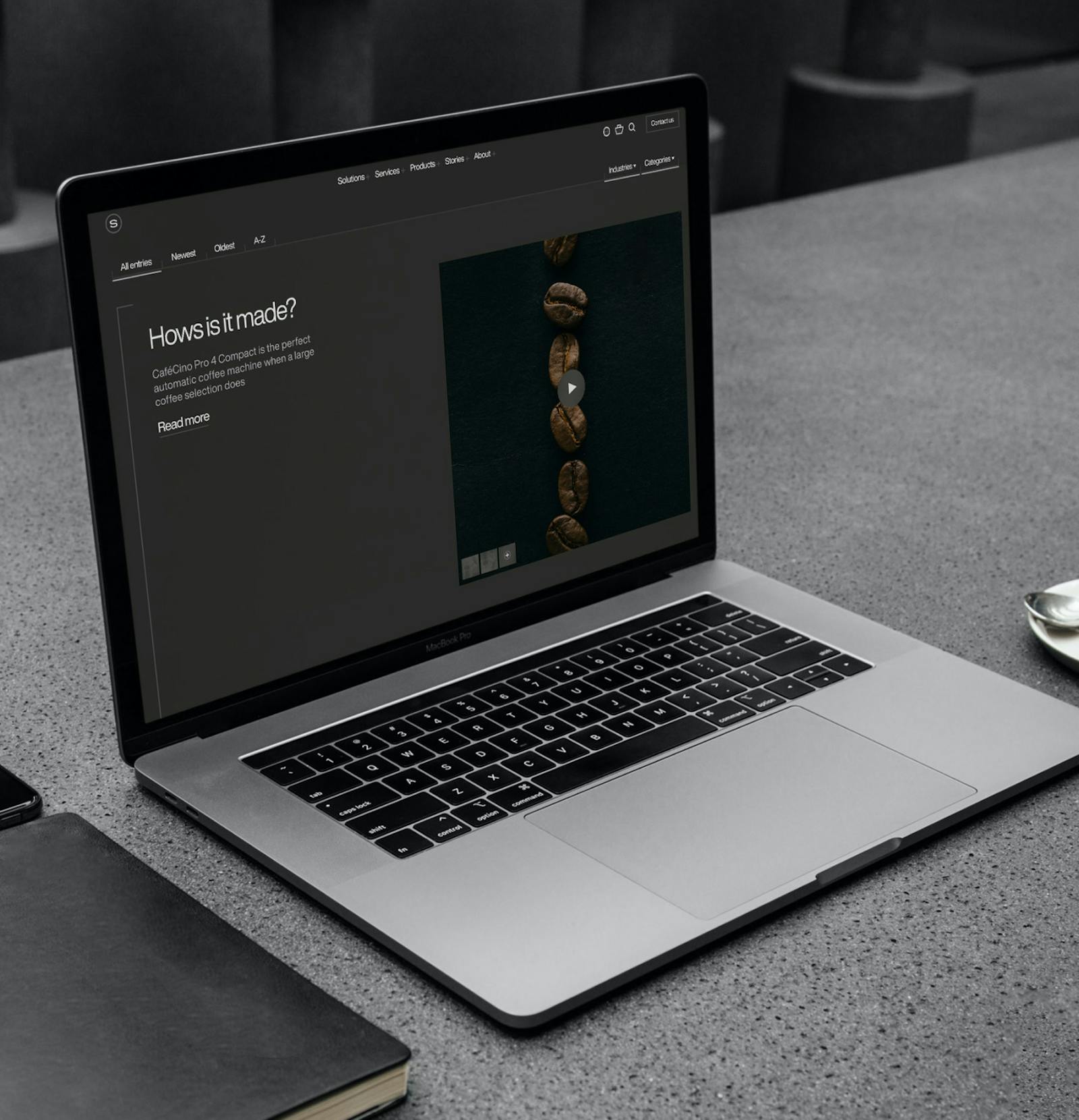
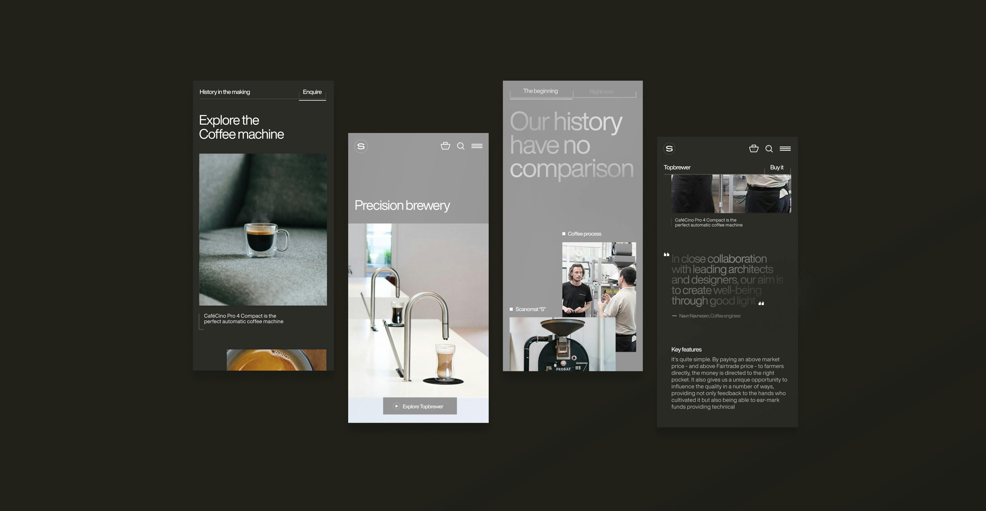
Umbraco was used to create a highly flexible modular platform that made it super easy for Scanomat to spawn a new partner website – and ensuring that it was really fast and really easy for the partners to create and scale content to the different needs of their specific market. All this while Scanomat could still ensure the brand, product, and content consistency across all partner websites around the world.
Umbraco was used to create a multi-lingual structure that could easily spawn a new partner site in a new language – and Jumoo was used to quickly translate reusable and non-market-specific content. Umbraco forms were chosen to make it easy for Scanomat to build Call-to-Action friendly contact points and to make sure that leads landed in the hands of the right partners.
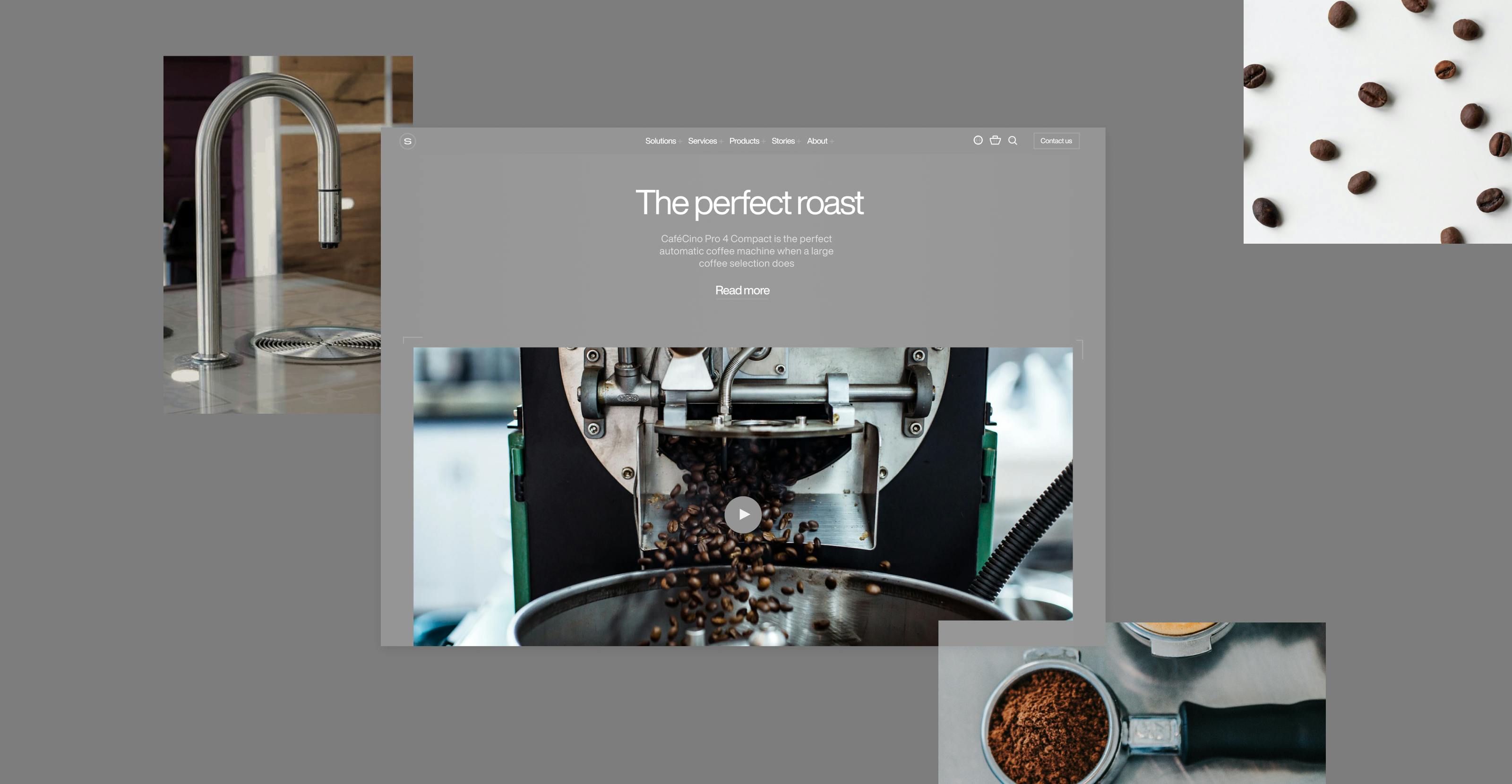
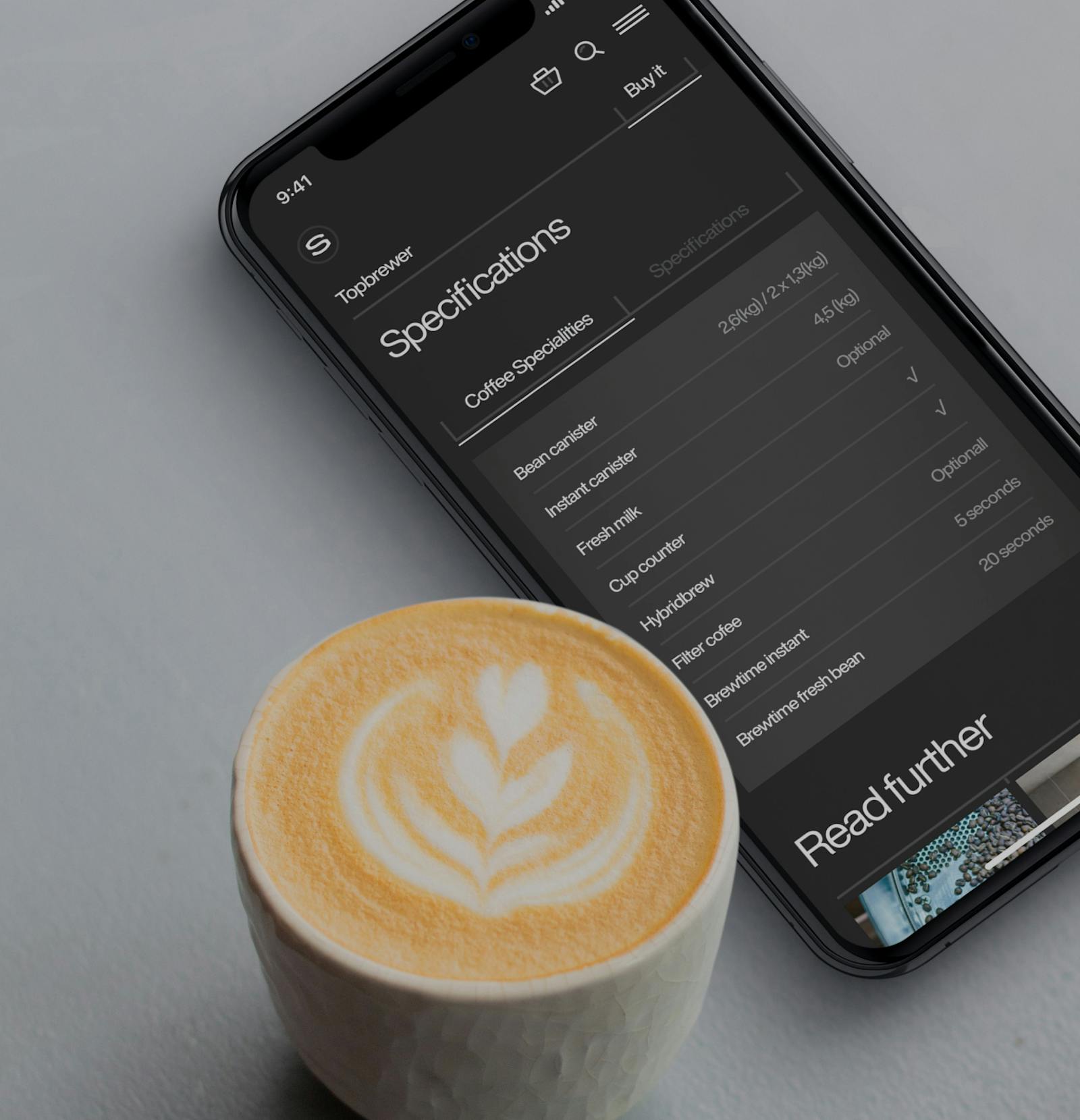
The new solution carries a load of a flexible yet stringent task of communicating services that includes Scanomat's advanced cloud management system for their TopBrewer machine with state-of-the-art real-time data for your organization, end-user apps that make it easy to order and pay for a cup of coffee on an app which of course also includes payment via Google- and ApplePay. The website also offers all relevant technical info and installation drawings for architects and technical staff who works within hospitality, retail, and office sectors around the globe.
All these changes called for an updated digital identity that embraced the luxury feel of the Scanomat products – from the bags the coffee comes in to the presentation of the machines and the story behind the sustainable way the Amokka coffee is grown and harvested in.
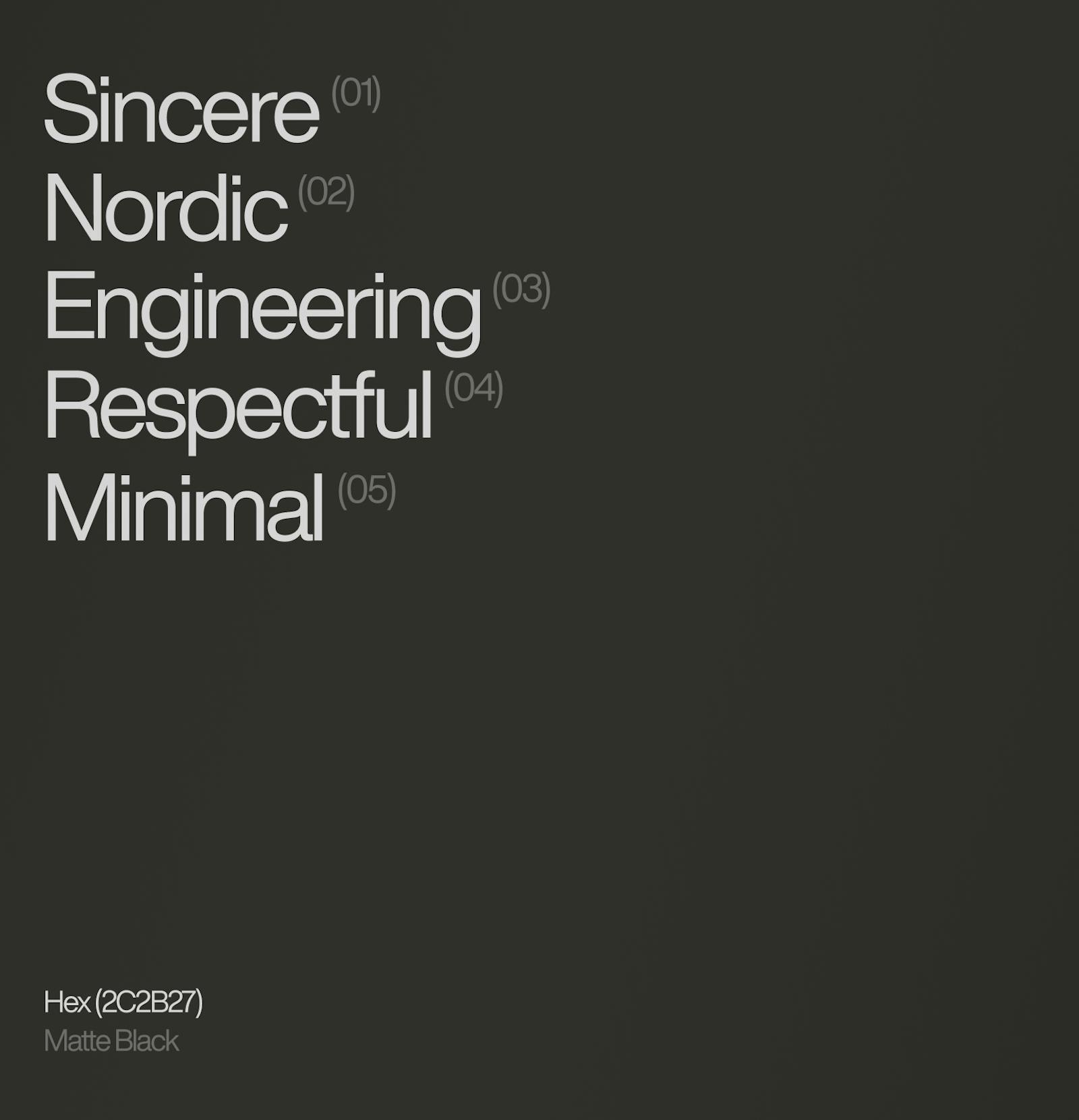
We wanted to embrace the metallic feel that the coffee machines carry – to mimic the actual product that meets the end-user. By using small graphic elements, tight grids, and large images we created a look that showcased Scanomat's products as quite technical but with a hint of editorial lifestyle from the Nordic tradition.
The visuals are very honest. You buy what you see. Throughout the process, and numerous iterations, we managed to cut out everything unnecessary to achieve perfection. The only way to achieve perfection, really. Just like creating the perfect cup of coffee every single time. "Something a mere human or a barista could never do".
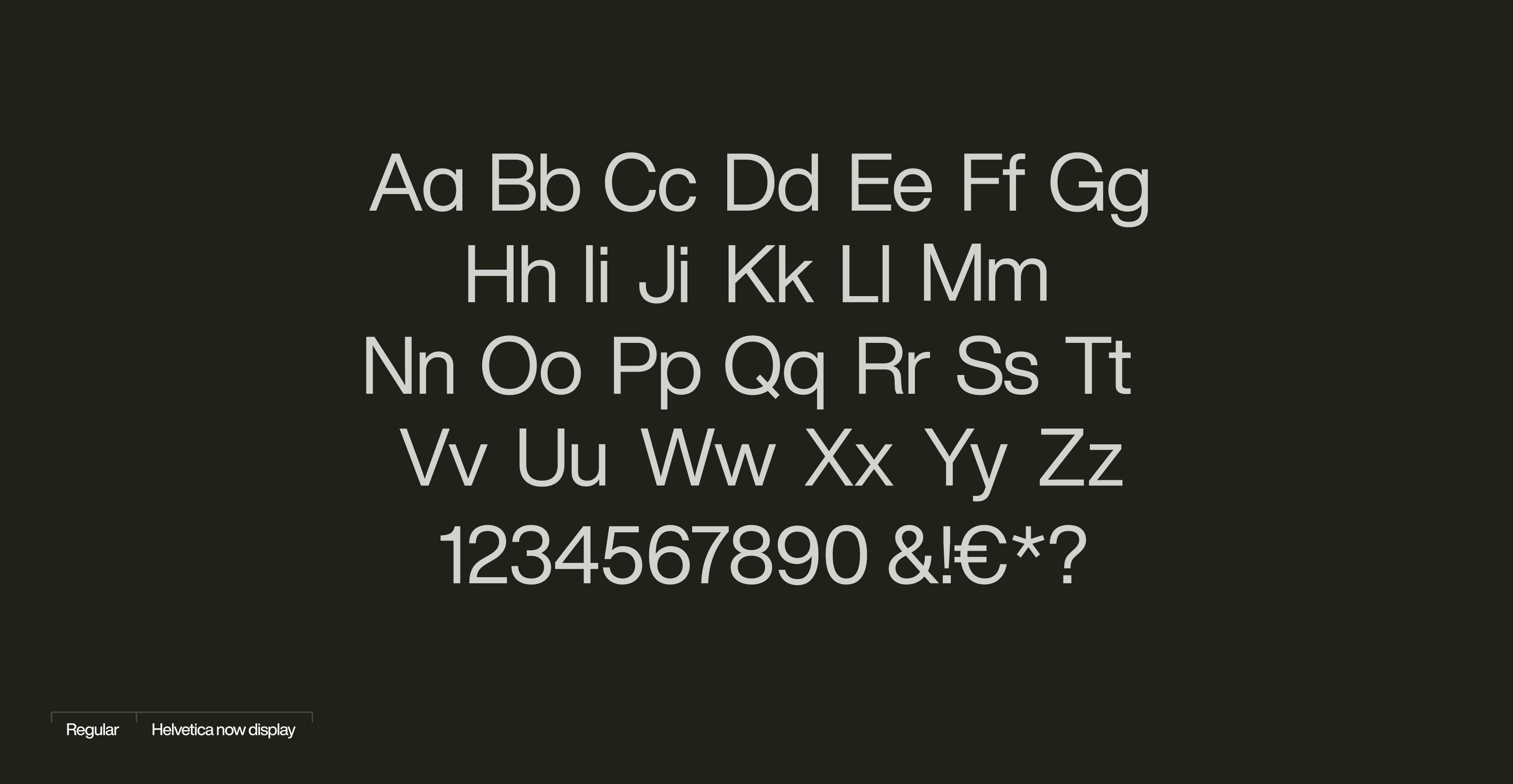
By using the updated version of the most famous typeface in the world, Helvetica Now, combined with a gradient, metallic foil treatment we created a 5th element feel to both Scanomat's new website and packaging.
The design relies on two ways of using color. Metallic, which resembles the materials and resources that go into a Scanomat product.
And a matte black that tones down the site giving it a dark roast feel that oozes exclusivity and warmth. This also gave us the nordic simplicity in which great imagery can unfold its power and storytelling.
The Result
It's still early days, but alongside the international brand site and Danish scanomat.com site, several partners all over the world are building new websites.
This means that Sweden, Norway, UK, Canada, Russia, and France are about to launch market-specific sites based on the solution. And with everything gathered underneath the Scanomat brand, the whole experience of services, products, and technical information is lighter, more precise, and clearer.
For the international and Danish sites this means that even without any paid media to secure traffic, the number of visitors has doubled compared to the same period last year. So, tendencies are promising...
"Dwarf understands Scanomat. From the start, they have done a great job of understanding our company from the inside out with great interest and coming up with incredibly exciting and aesthetic solutions. With their broad competencies, they have managed to help us set our digital and visual direction for the next several years and delivered a stable and well-worked solution that makes a difference both as a razor-sharp "digital showroom" to the outside world but also increases the productivity of the house to the great delight of our many users."

Sebastian Vibe-Petersen
Management at Scanomat

Sebastian Vibe-Petersen
Management at ScanomatContact


Other work

Divisionsforeningen
One for All....