DR Ramasjang
What Can You Learn From a Four-Year-Old?

2020
What Can You Learn From a Four-Year-Old?
More than you might think. The target audience for DR Ramasjang is children from 4-8 years, and this target audience needs a different UX strategy than what Dwarf is used to delivering. The experience needs to be explorative with a navigation that is intuitive and able to work without any text and heavy ‘adult logic’.
The Task
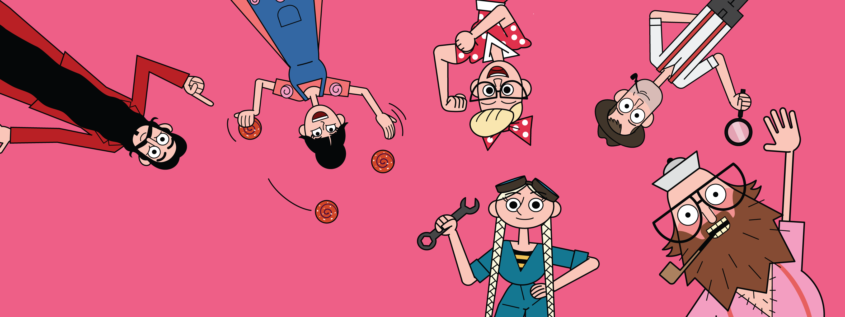
DR Ramasjang has a strong tradition of developing quality content for kids. From Kaj & Andrea and Teddy & Chicken (Popular Danish kids-characters from the 80s) and up to today's Onkel Reje (Uncle Scrimp), Motor Mille, Rosa, and Hr. Skæg (Mr. Beard)(All popular characters of the Ramasjang TV Universe), you can truly tell that DR Ramasjang has a flair for developing engaging content that is loved by all kids. The new concept was built on this unique understanding and empathy towards the worldview of the kids.
All the content has been made digital – And even available in a Ramasjang App launched back in June 2018. Since then, the universe just grew more – and the front page in “The Island of Ramasjang” was about to be overpopulated.
Dwarf received the task to develop a new concept for the front page in the app with three main goals: 1. Larger scalability – in order for the content to have the necessary space on the front page, 2. Shorter time from idea to release and 3. Maintaining the changeable entrance to the universe.
The Solution
Dwarf has developed a concept for the front page for Ramasjang where the island received a vertical dimension. Children can now explore the island; under the sea, at the bottom of the ocean and even deeper as well. Or the other way around. Up in the air, jump on the clouds or travel even further into space. Ramasjang offers an enormous canvas to work on, and there is space for everything you could wish for.
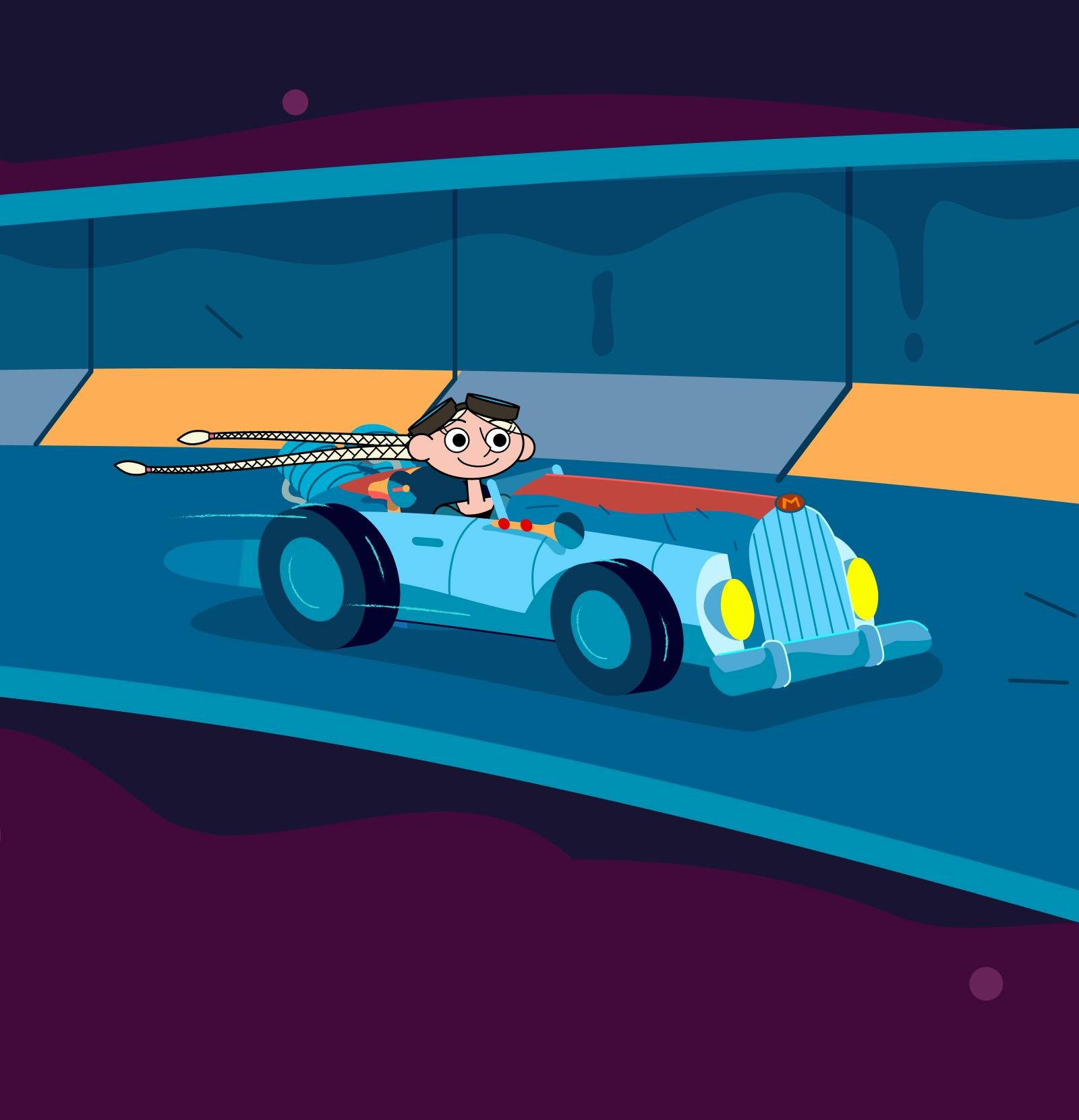
To improve the experience, we changed the design in collaboration with our talented illustration partners by Benny Box, and all our characters from the DR program received a new animated ‘alter ego’.
And even though Mr. Beard is always game to play, it is faster to animate his alter ego in his air balloon, than it is to collect ‘flying balloon permits’ from Copenhagen Airport in order for him to start his trip in the air.
Magic happens in this playful universe, and the editors can even build the entrance to Ramasjang themselves by combining graphics in layers, make animation presets and spines. A bit like an old-fashioned movie cartoon production with an animated and moving background.
The solution is developed in JavaScript-based module for integrations in a cross-platform Cordova app. We used Pixi.js to make a rendering of all different animation elements. We used Howler.js to handle the soundtrack on the website and the code is written in TypeScript.
The Result
The new front page was launched in March 2020, and the app is ranked in the top 3 in ‘Kids, age 5 years’ and in a subcategory in App Store. It also received top placement in the Google Play Creative Family category and placed within the top 10 in all age groups from 0-9 years.
We are proud of the result, but we have not hit the goal as yet. A lot of the kids in the target audience have inherited their device from older sisters and brothers, and it calls for a lot of 'development magic' not to hit the technological limits on hardware.
We also learned a lot from the target audience – they really value playful, surprising, and engaging user experiences – even when they are not playing.
People
Other work

DR Ramasjang
Character design for DR Ramasjang
