HALO
Redesigning HALO's e-commerce platform

2024
Redesigning HALO's e-commerce platform
HALO is a Danish apparel brand born in the special forces and raised in the city of Copenhagen. HALO is on a mission to elevate its digital presence and wants to create an exclusive brand experience on the ecommerce platform. And this is where Dwarf comes into the picture.
The Task
At HALO, they celebrate the art of seamless transitions. Born in the Danish Special Forces and raised in the city, the brand believes in the power of adaptability above and beyond. HALO is on a mission to create multipurpose clothing and gear serving as a statement of intent: whether conquering concrete jungles or conquering a personal best, HALO empowers you to navigate every terrain with flair. From city streets to untamed wilderness, from power lunches to power lifts, the brand is all for the great explorations and the everyday missions. No matter the conditions, you’re ready to FACE ALL FRONTS.
The brand position and statement had to align with the vision for a modernized online presence and brand positioning. Therefore, HALOs ecommerce platform needed a redesign to become an inspiring and exclusive brand store that gives the customers a strong and clear brand experience and still focuses on conversion rate optimization (CRO).
The Solution
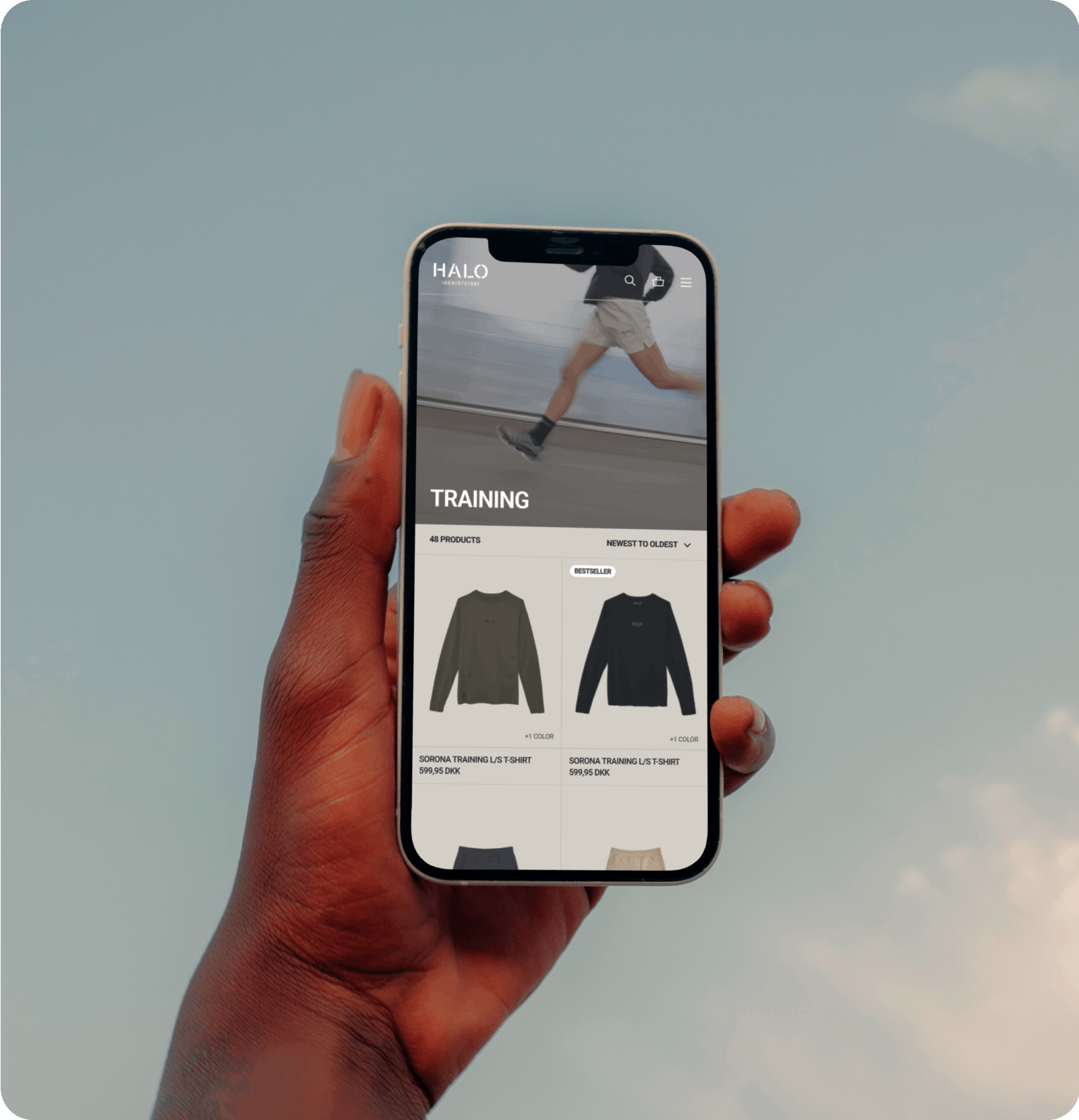
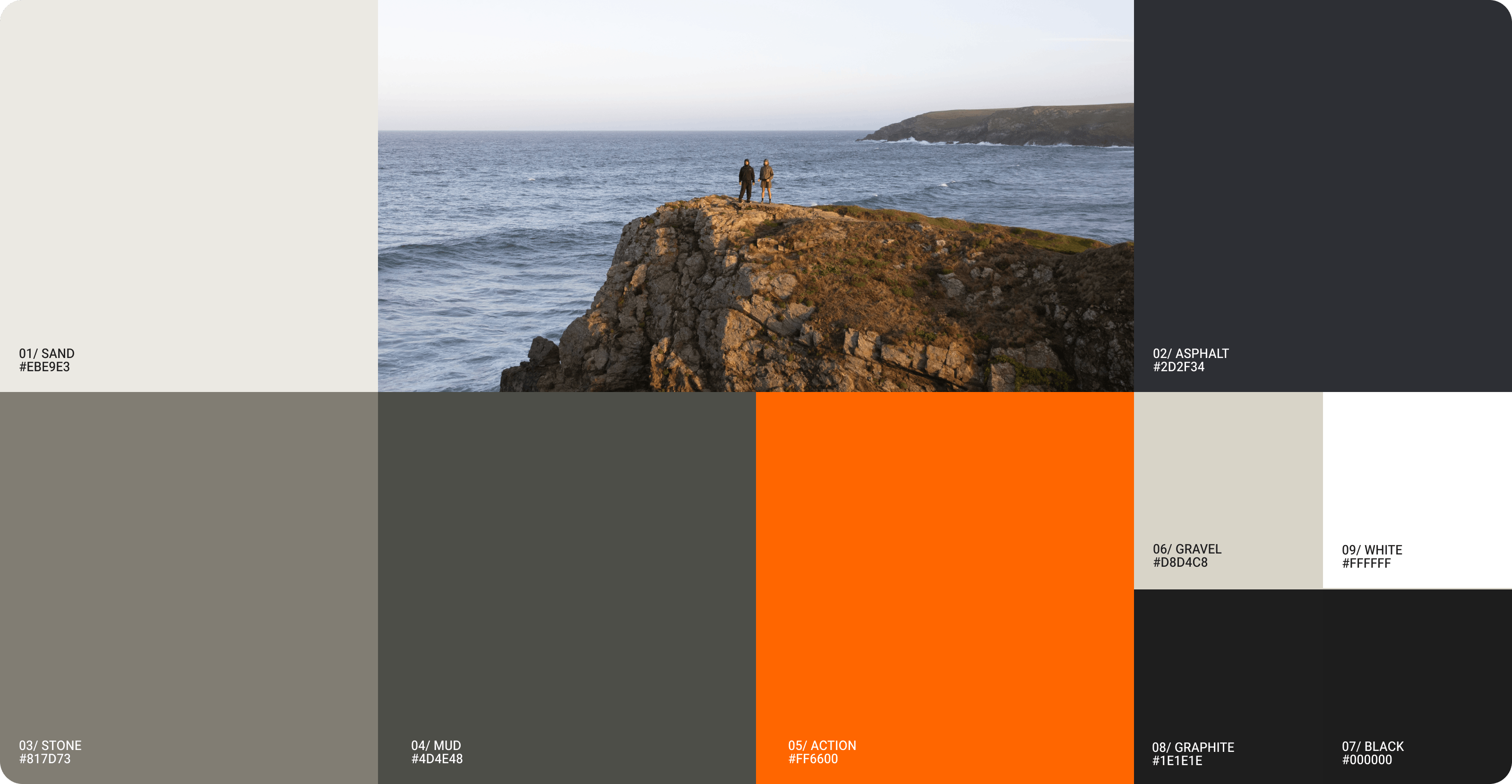
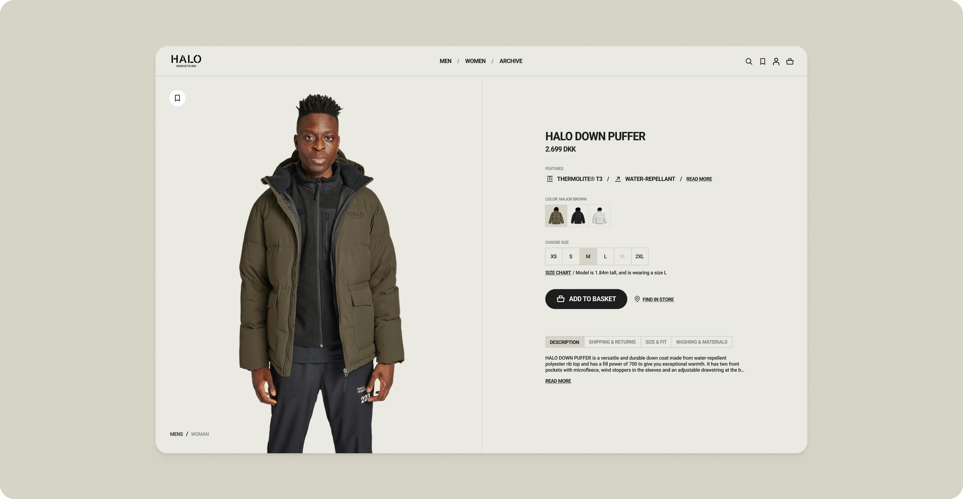
Dwarf made an updated version of HALO’s visual identity and designed the new look of the ecommerce platform to create a more engaging, exclusive, and visually appealing brand experience for the users. Building upon the existing font Roboto, small adjustments were made to its appearance, enhancing its elegance and modernity. This adjustment retained the brand's existing identity while offering a refreshed and refined typographic style.
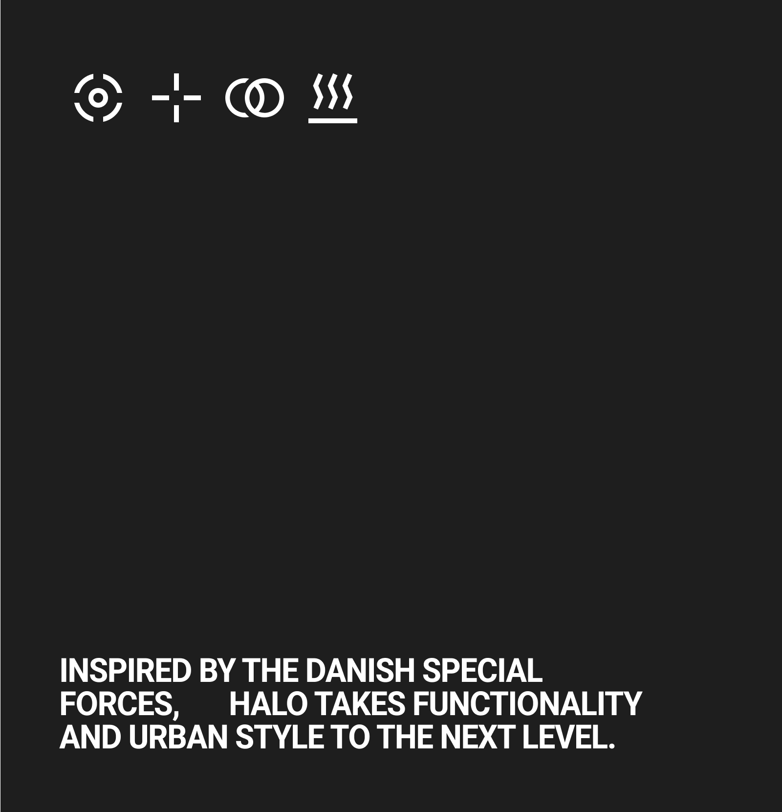
Dwarf also designed new UI components such as icons for product categories and UI elements like the shopping cart to ensure a cohesive interface of the shop. The icons are inspired by HALO's logo and tactical heritage. The icons are bold and robust, and paired with a similarly weighted condensed typeface, allowing HALO to create clear wayfinding around their product categories as well as visualize their technology and benefits. The icons are drawn based on a 1px stroke in a 16px grid, and are optimized to be used in small, medium, and larger sizes across HALO's communication collateral, and ultimately help create a visual hook that makes HALO stand out.
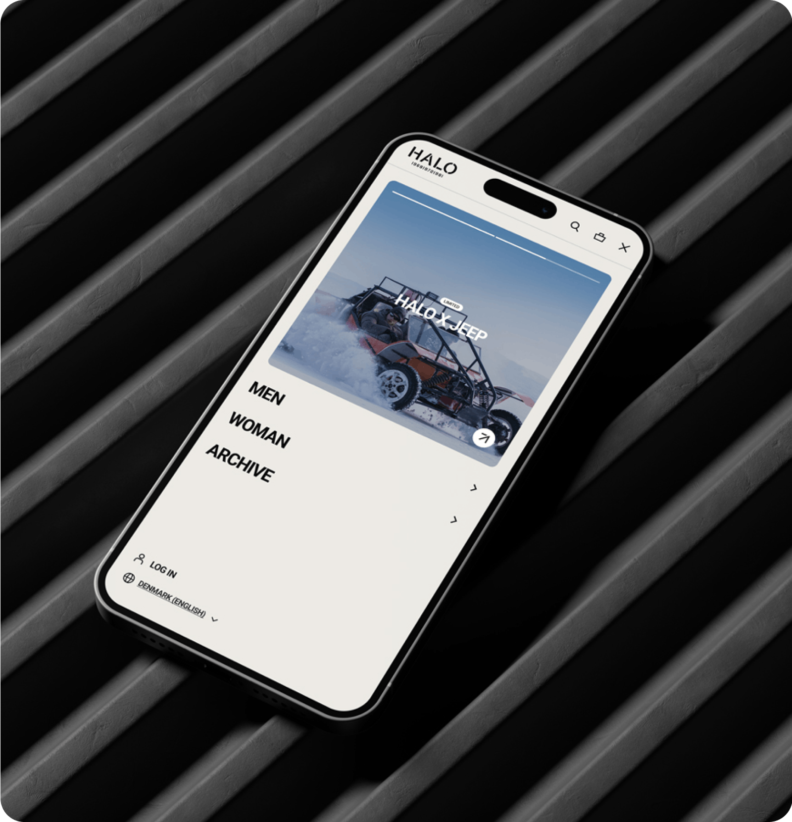
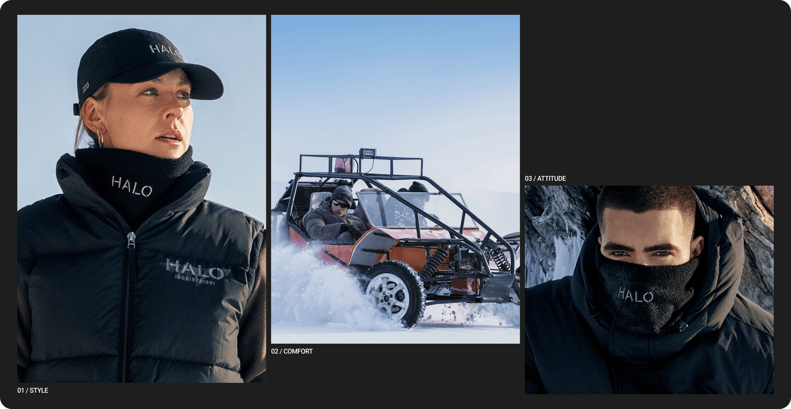
A new navigation menu facilitates content discovery better and makes it easier for the user to find the content they’re looking for. Campaign sites and the focus on editorial imagery elevated brand storytelling and product presentation, which also included the “Shop the look” feature that creates a more aspirational and relatable shopping experience while emphasizing product visibility and desirability.
To ensure the best possible circumstances for HALO’s Salesforce developers, Dwarf created a detailed style guide and documentation to specify the design changes and interaction elements.
The Result
The redesigned HALO site went live on April 11, 2024. The result was a more engaging and visually appealing online presence that met HALO’s goal of creating a more inspiring and exclusive brand experience on the ecommerce platform.
"Dwarf has been a strong collaborative partner in the redesign project for HALO. They have managed to understand our brand, challenges, and visions, creatively enhancing our shop's look and feel without compromising our commercial objectives. The entire team at Dwarf has been very professional and dedicated."

Rikke Truelsen
Digital Business Development Manager
People
Team


Maria Frøsig Christensen
Digital Designer



Nicolas Verhelpen
Digital Designer
Other work

Hummel
The World of Hummel


