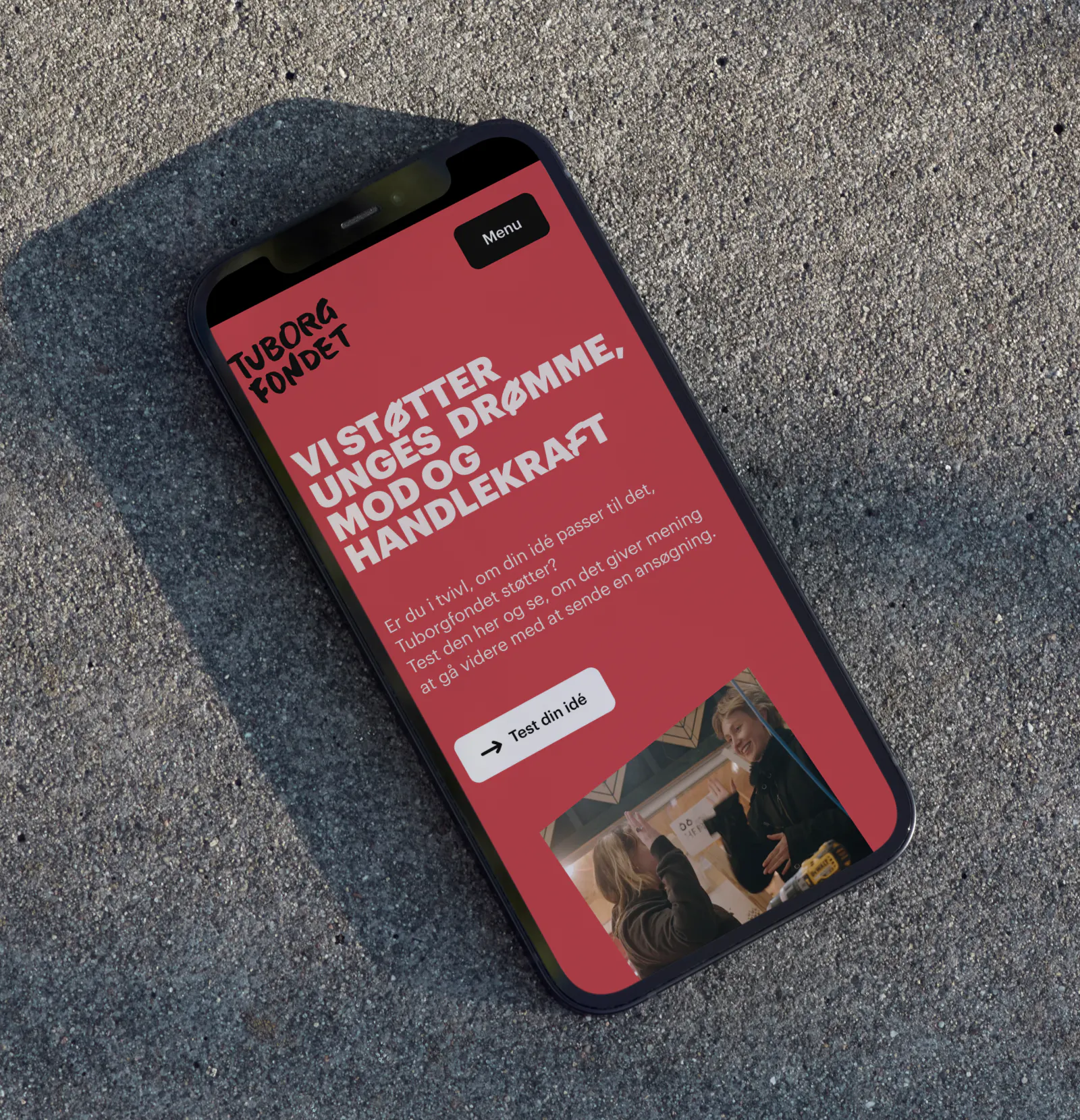
A new digital universe that makes it easier for young people to find their way to support.
The new tuborgfondet.dk brings the foundation’s mission to life in a more vibrant, intuitive, and accessible way. With a stronger digital identity, simplified navigation, and a flexible platform foundation, the site is built to better support young applicants in finding answers and moving from curiosity to action.
Task
Tuborgfondet plays a central role in supporting young people’s dreams, courage, and capacity to act, but their digital presence no longer reflected the energy, clarity, and accessibility that define the foundation’s work. The existing website was marked by unstable performance and a complex structure, with content that had gradually evolved without a clear common thread. As a result, the digital experience no longer fully matched either the target audience or Tuborgfondet’s ambition to be accessible and relevant to young people.
The task was therefore to rethink the identity, structure, and technology behind the platform. Tuborgfondet also wanted a contemporary update to the visual expression. The user experience needed to be more intuitive and better adapted to the target audience. In addition, the technical platform had to make it easy to find answers, navigate, and take action. The goal was to reduce complexity, increase clarity, and shorten the path from curiosity to application.
Solution
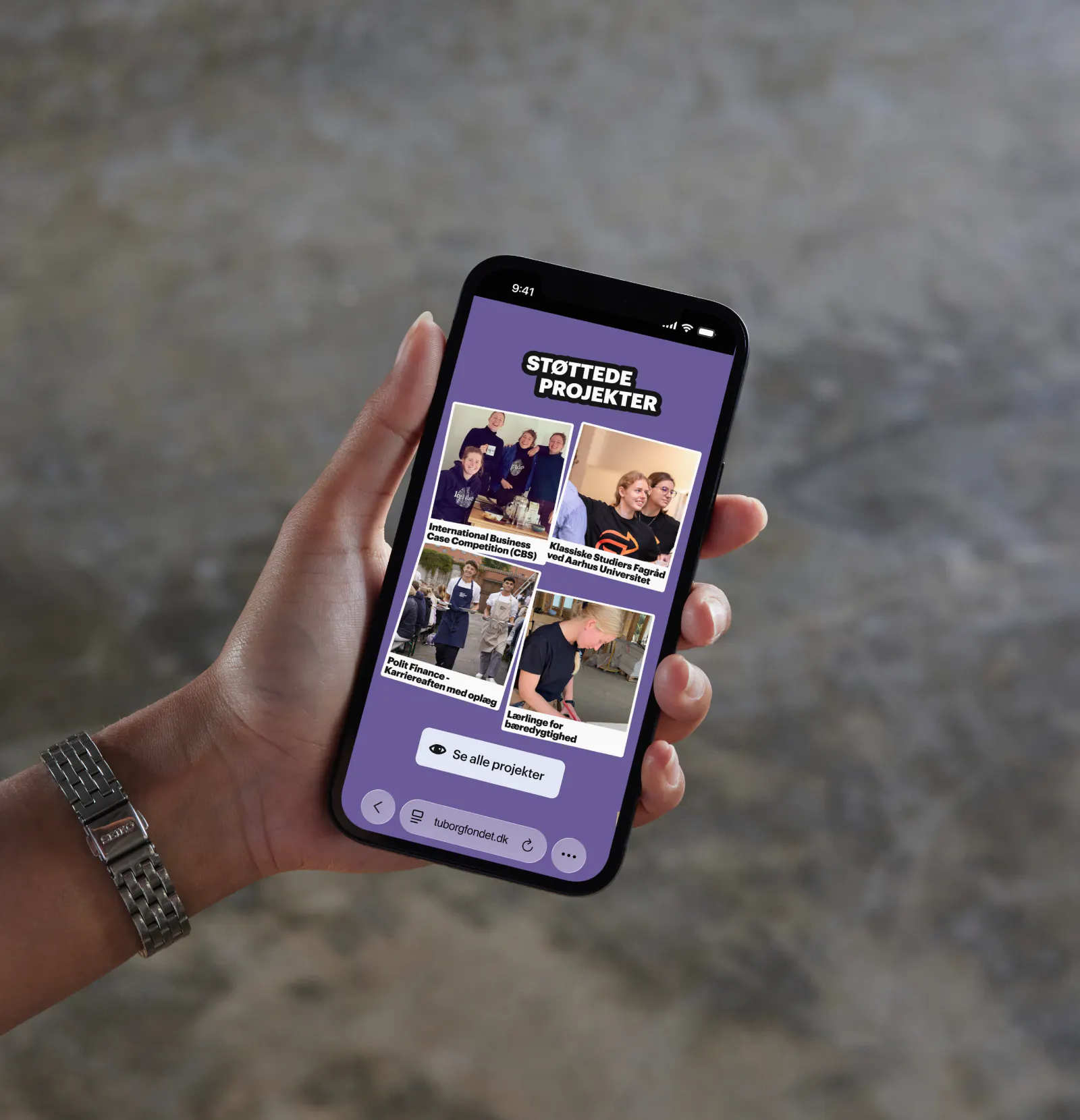
Tuborgfondet’s digital universe has been reimagined from the ground up - from visual identity to technical foundation. The updated visual identity introduces a sharper logo, web-optimized colors, and a more consistent visual expression, where typography, graphics, and animation work together to create a vibrant and recognizable universe. At the same time, the tone has been made more playful, allowing the communication to better resonate with the target audience.
The user experience has been simplified through a small number of clear entry points, with “For Applicants” serving as the central hub. Here, content is gathered and structured in a way that intuitively guides users forward.
Across the site, interactive elements, animations, and imagery have been used to create a more engaging and less static experience. Technically, the solution is built on a modern setup with Sanity as the headless CMS and Next.js on the frontend. This enables a flexible and dynamic platform where content can be assembled across the site and filtered intelligently, ensuring it always appears relevant to the user’s context. At the same time, the editorial tools have been significantly improved, making it easier to manage content and keep the site up to date.
Result
The new tuborgfondet.dk is a stable, cohesive, and visually strong platform that reflects the foundation’s identity and ambitions far more clearly. Navigation has been simplified, and the content is now more accessible and easier to find. The experience feels more vibrant and engaging, especially for applicants, who are now met with a clear and coherent entry point to the information they need.
Additionally, Tuborgfondet now has a future-proof technical solution that makes it possible to continuously develop and adapt the site without compromising performance or flexibility. Where the previous site was marked by limitations and complexity, it has now become an active platform that supports the foundation’s work and makes it easier to move from intention to action.
The content has been structured and prioritized so users are guided naturally through the site without having to spend unnecessary time decoding options and next steps. This reduces friction early in the user journey and makes it easier to turn interest into action.
To put it short: a digital upgrade that not only looks better, but also works better in practice - for both users and editors.


Contact


Other work


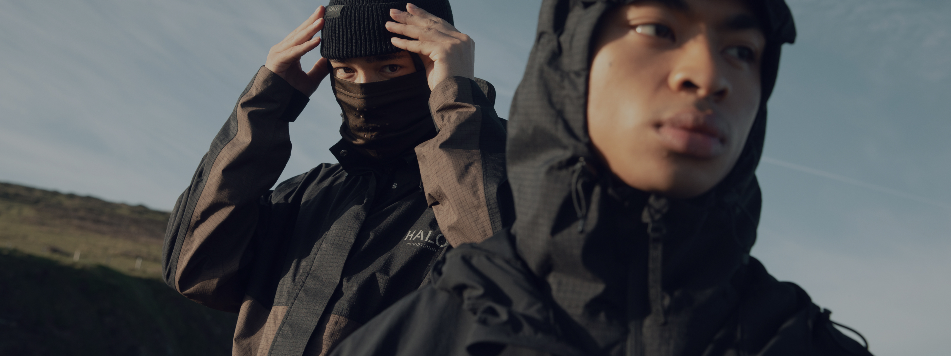
HALO
Redesigning HALO's e-commerce platform