Forlaget Falco
A new bird in town
2021
A new bird in town
An almost dangerous visual identity for a new challenger in the publishing industry.
The Task
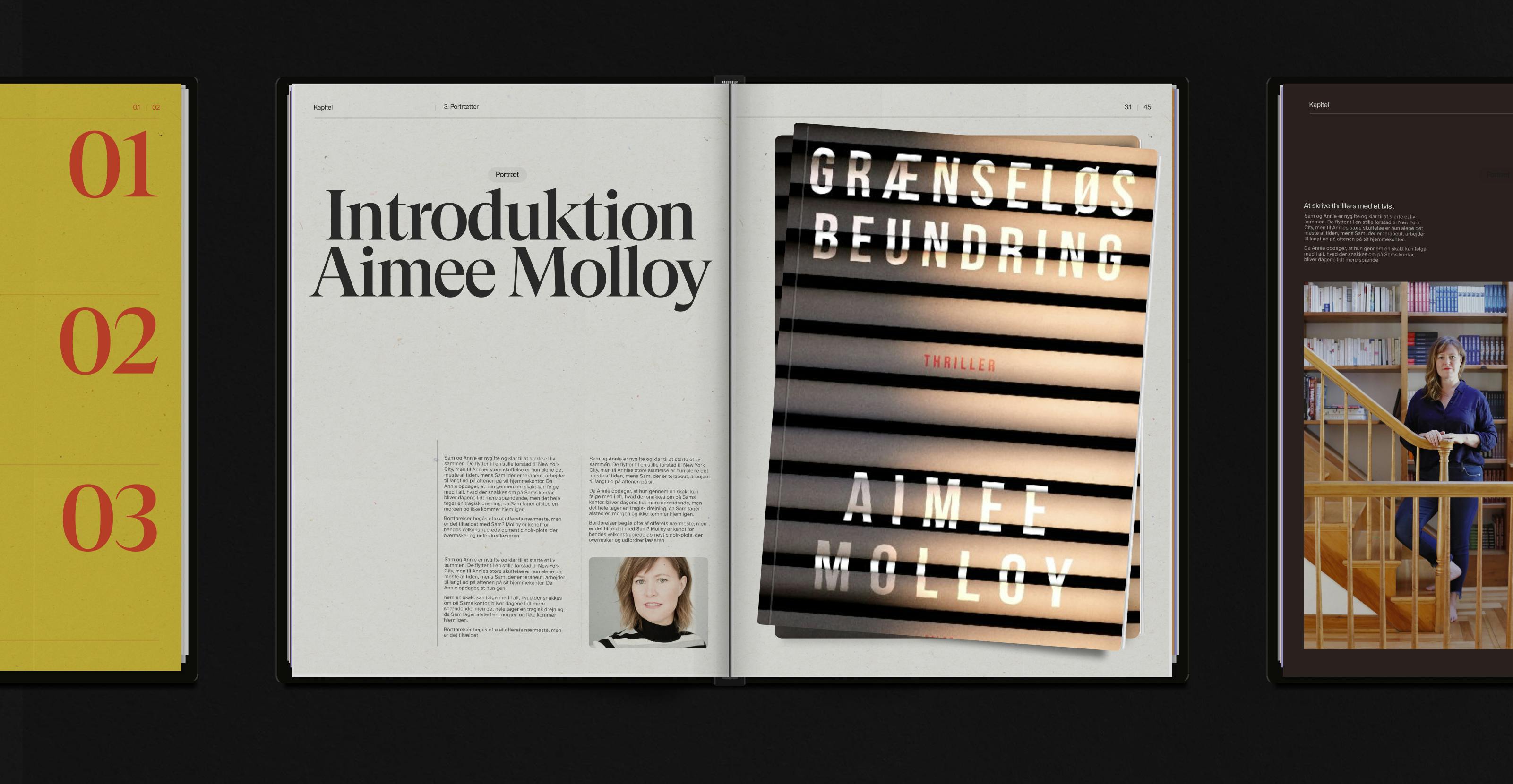
Falco is a brand-new publishing house established in 2021 by 4 literary enthusiasts, and we were fortunate enough to get the task of creating a full visual identity for the publisher that had to embrace the span between classically bound quality literature and modern fiction in various digital formats.
The Solution
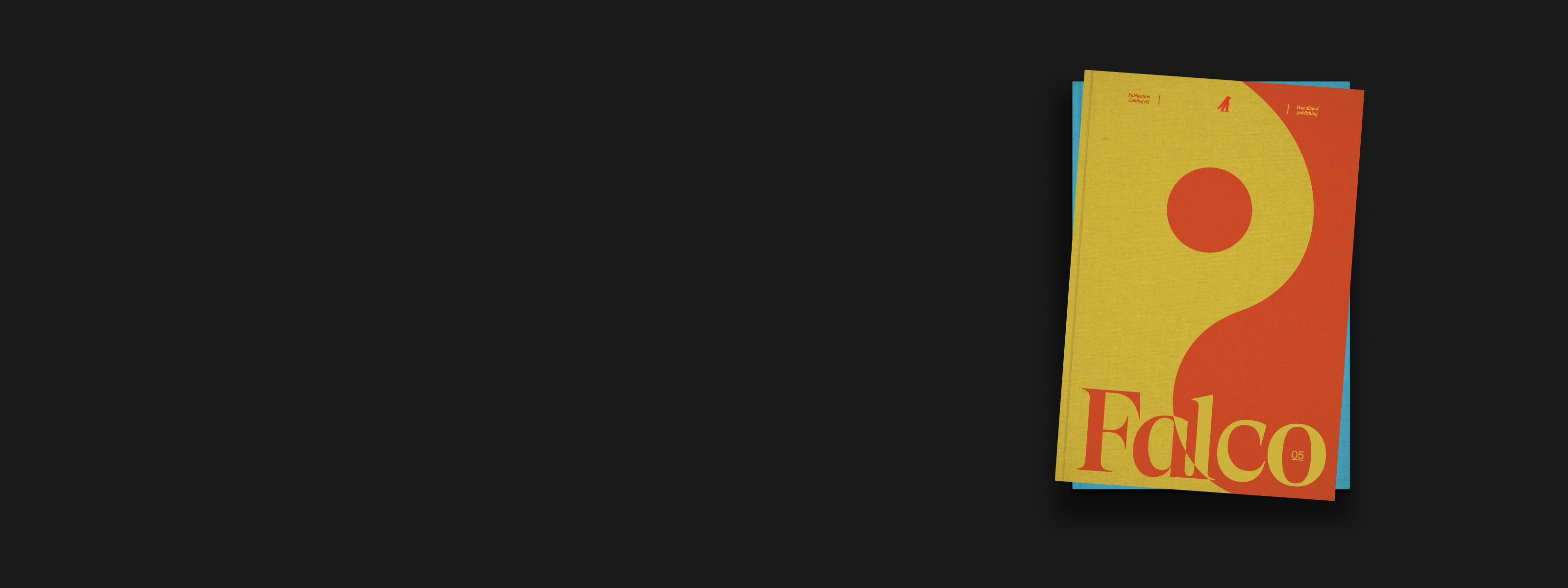
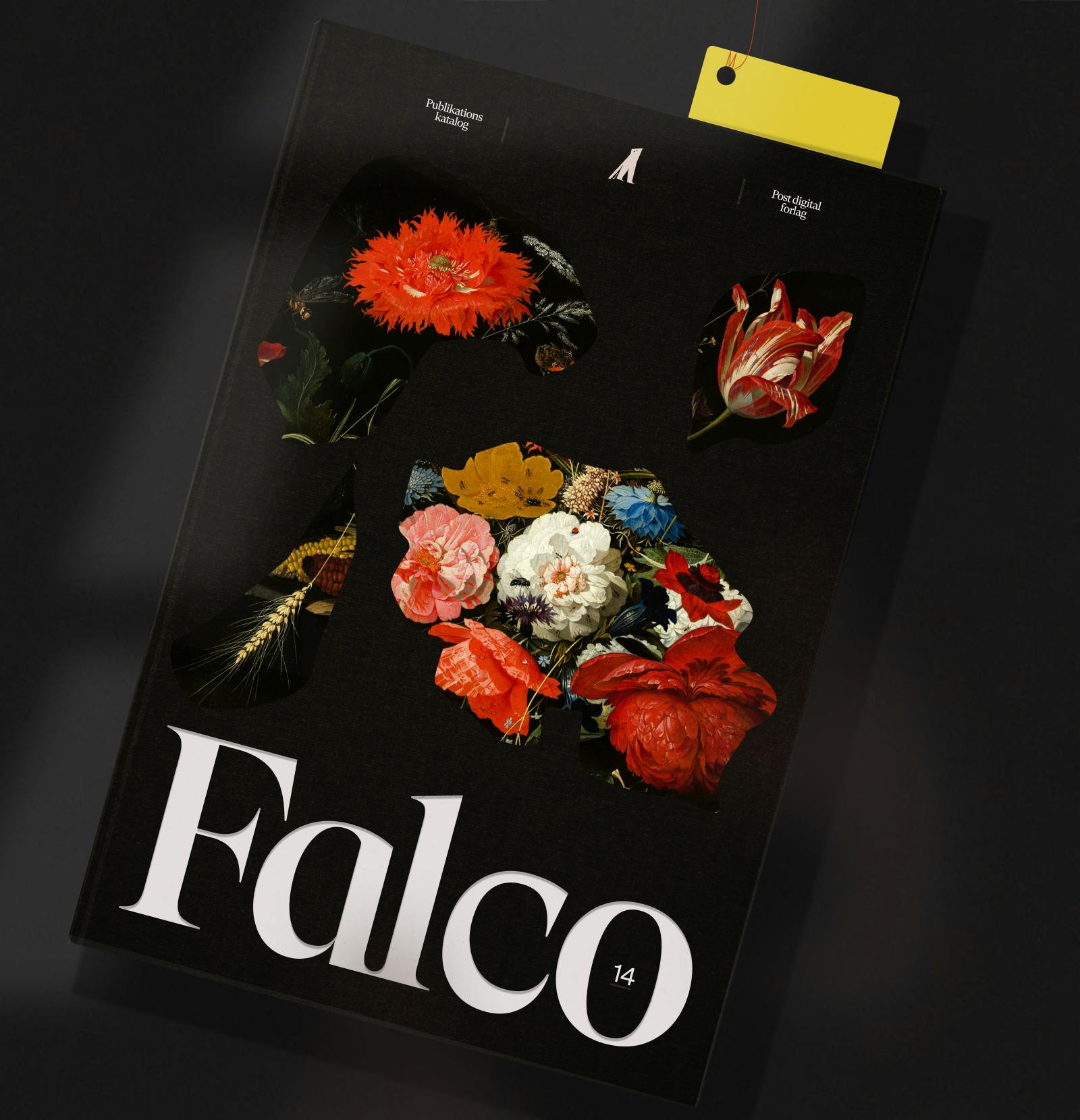
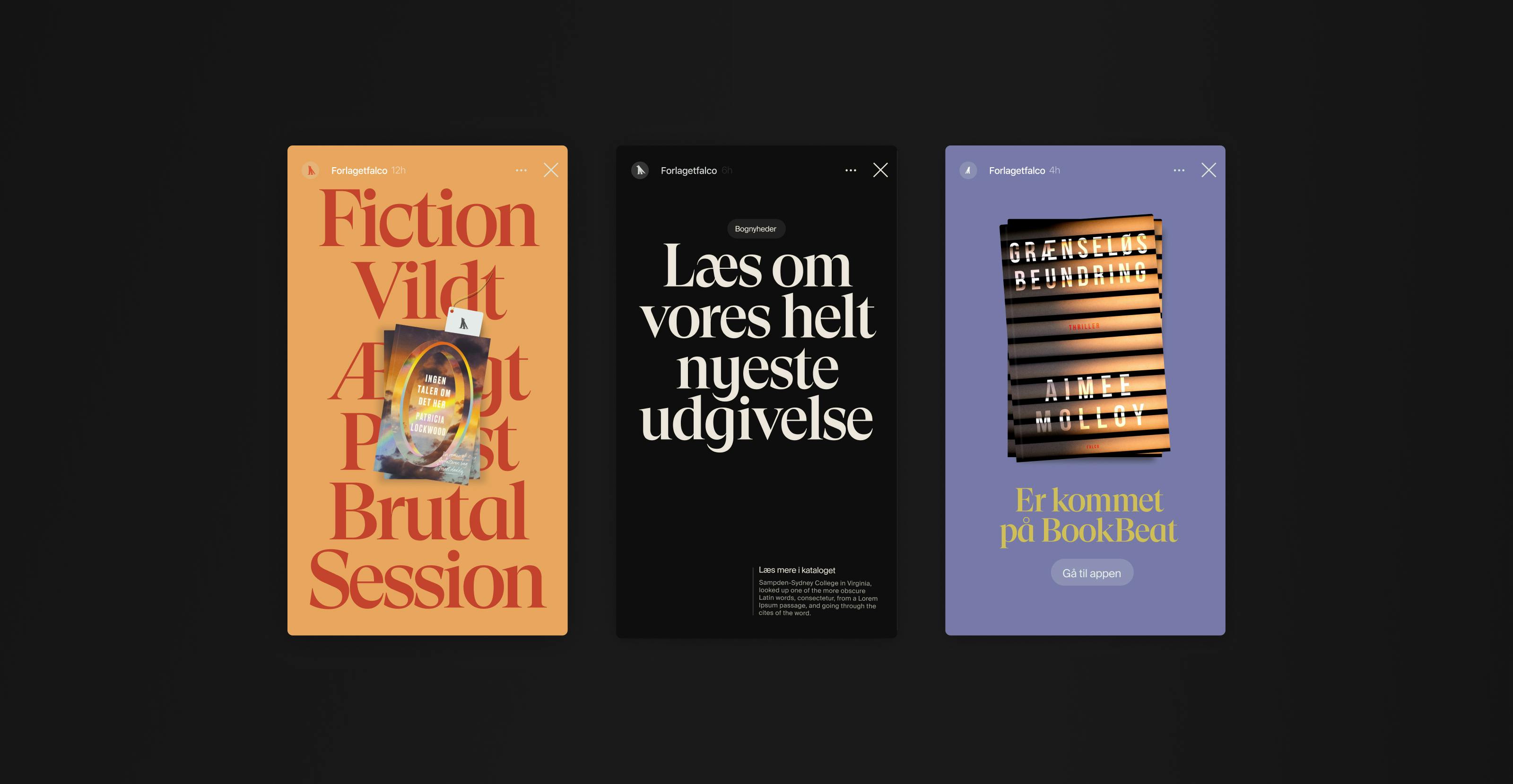
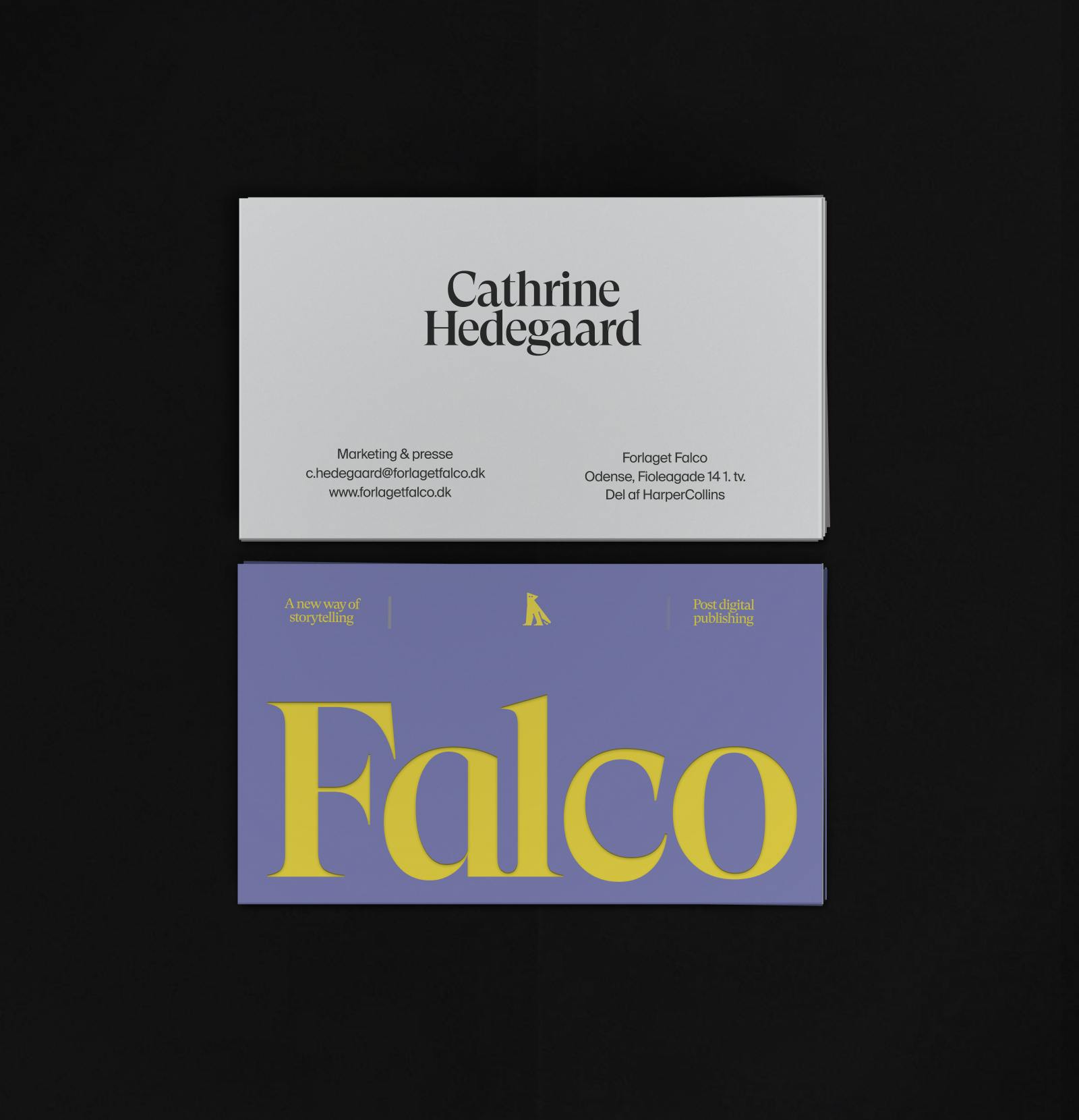
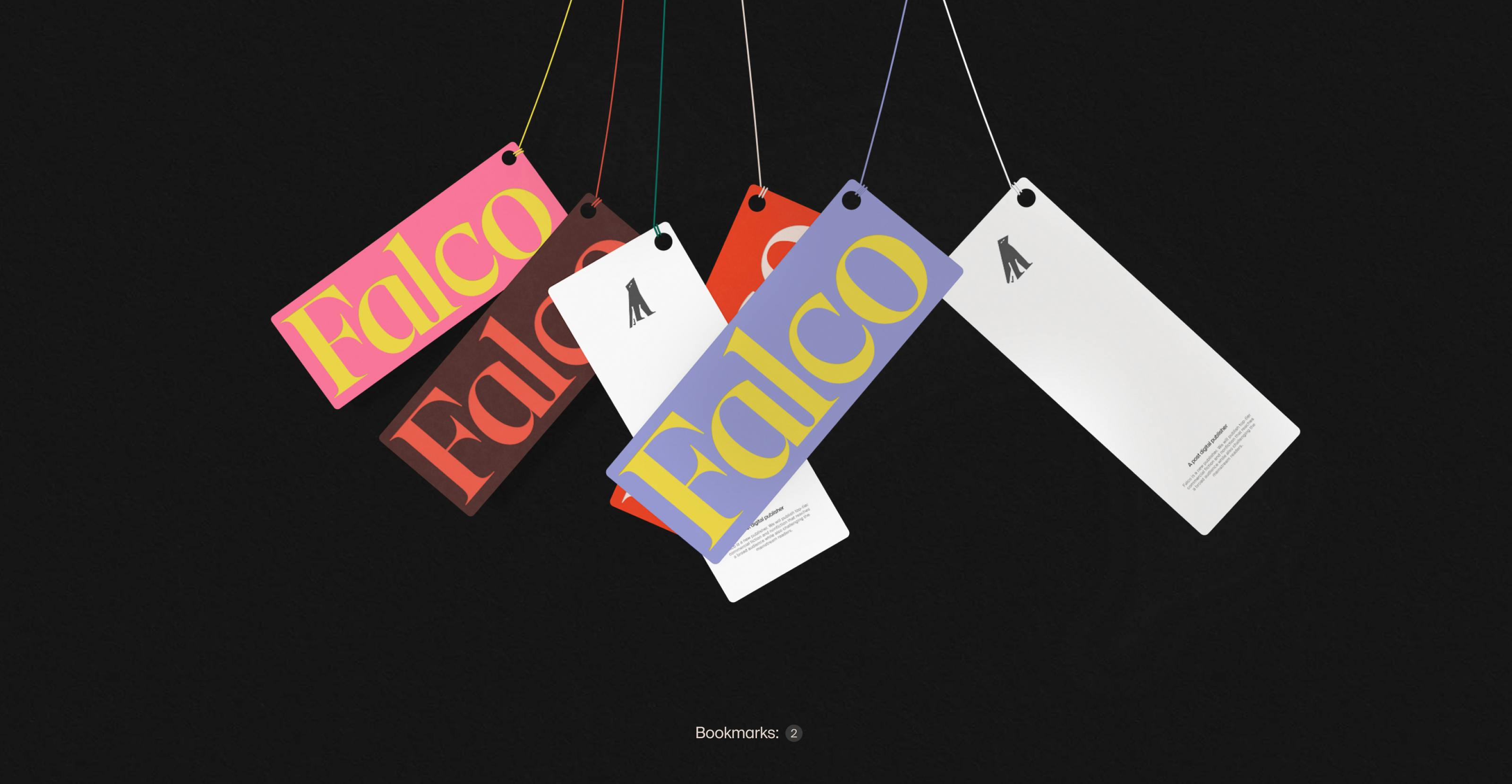
We created an identity that embraces the spread between classically bound quality literature and modern fiction in various digital formats with very bright color schemes paired with old classical typefaces. This clash between worlds creates a bold pop look aimed at a young, modern reader without forgetting its academic publisher's background.
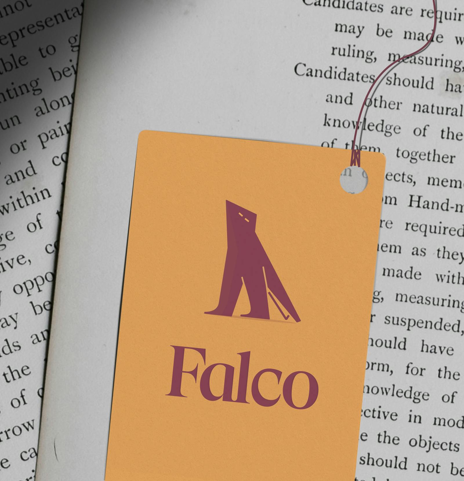
And there's just something about birds and publishers. Penguins, owls, cranes... and falcons. So, based on the falcon, we created a new character that is more sharp than clever and at the same time brave, almost dangerous.
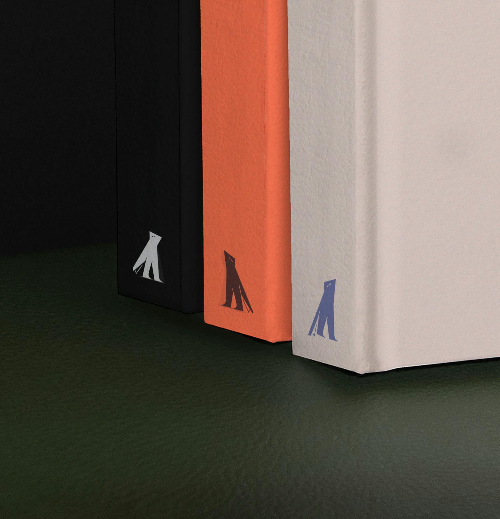
Falco is a secretive character who has his eyes set on the future. It is always moving and is therefore spotted in many situations, colors, and sizes, so it can appear anywhere. It can be seen moving on a book forum entry - or quietly standing on the back of a classic.
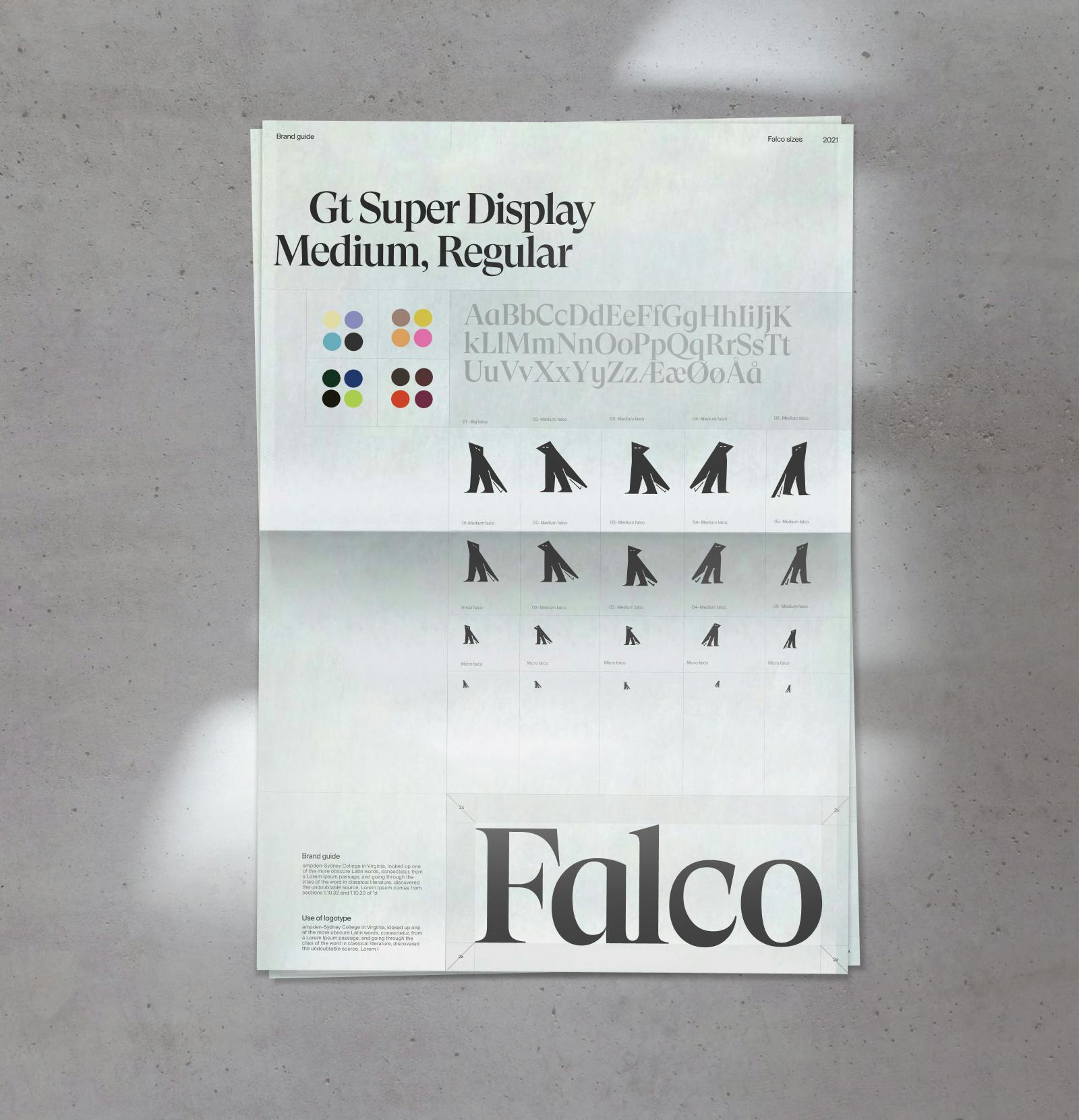
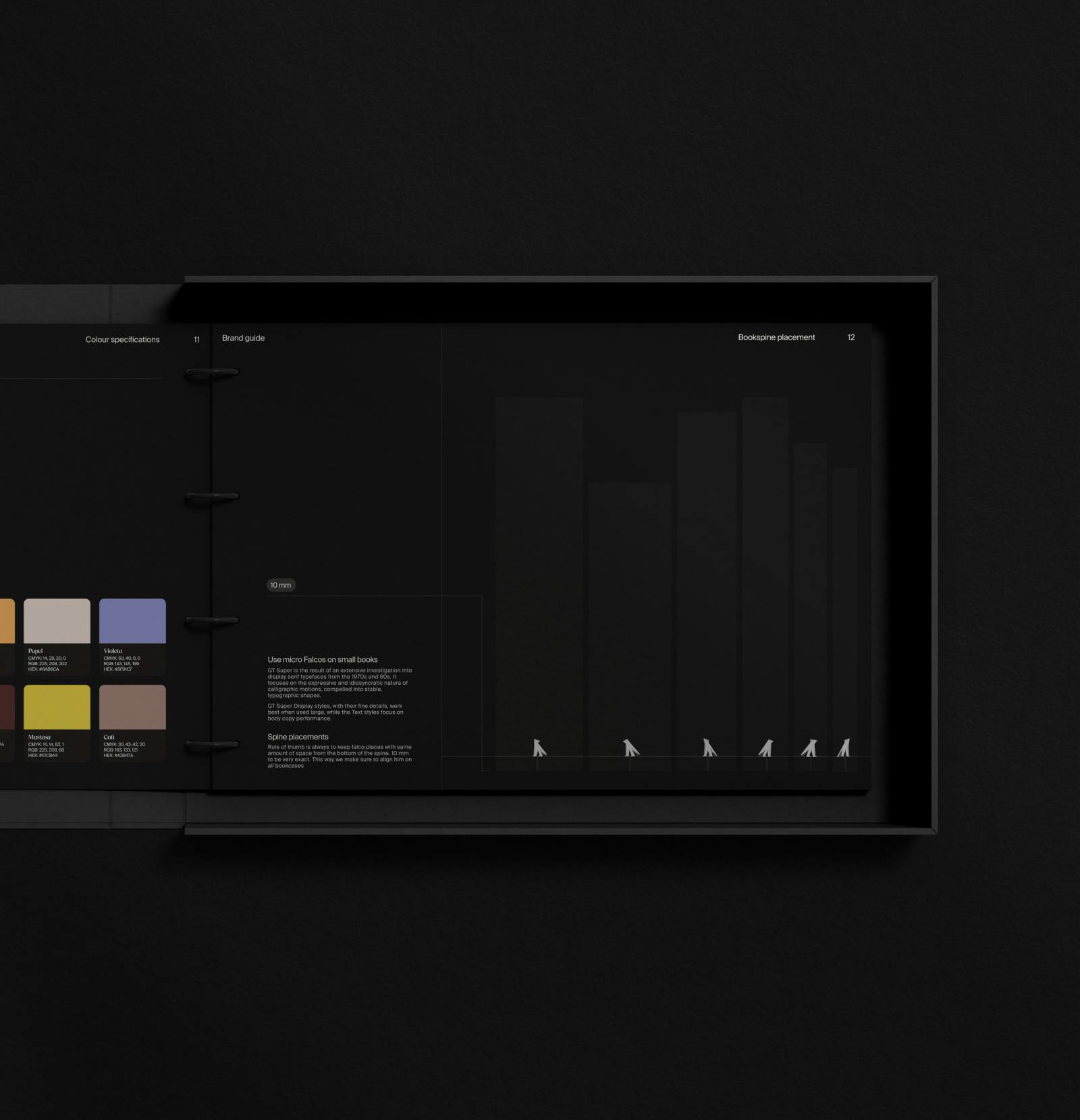
It’s a living and breathing mascot and that means Falco will always look different depending on its appearance. Therefore, we developed multiple versions in three different optical sizes to ensure recognizability on book spines, posters, digital platforms, and more.
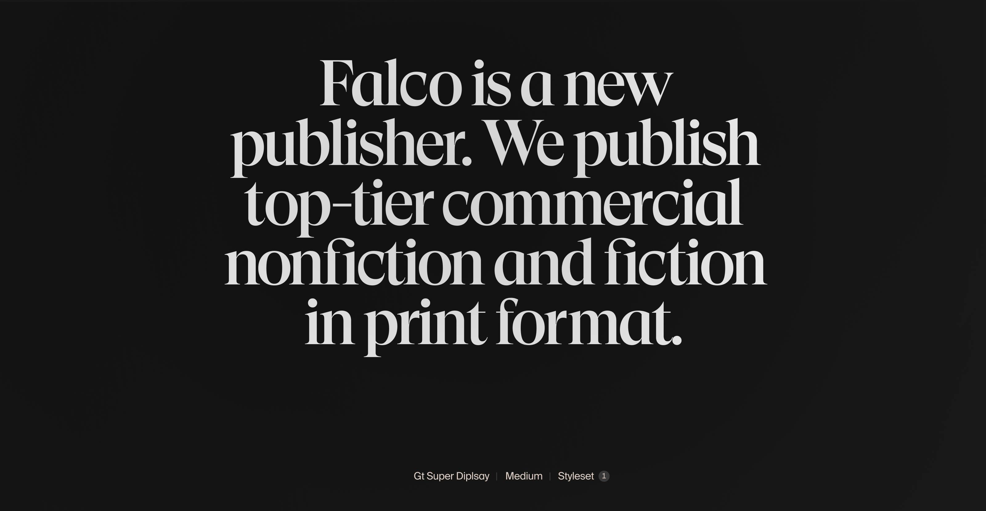
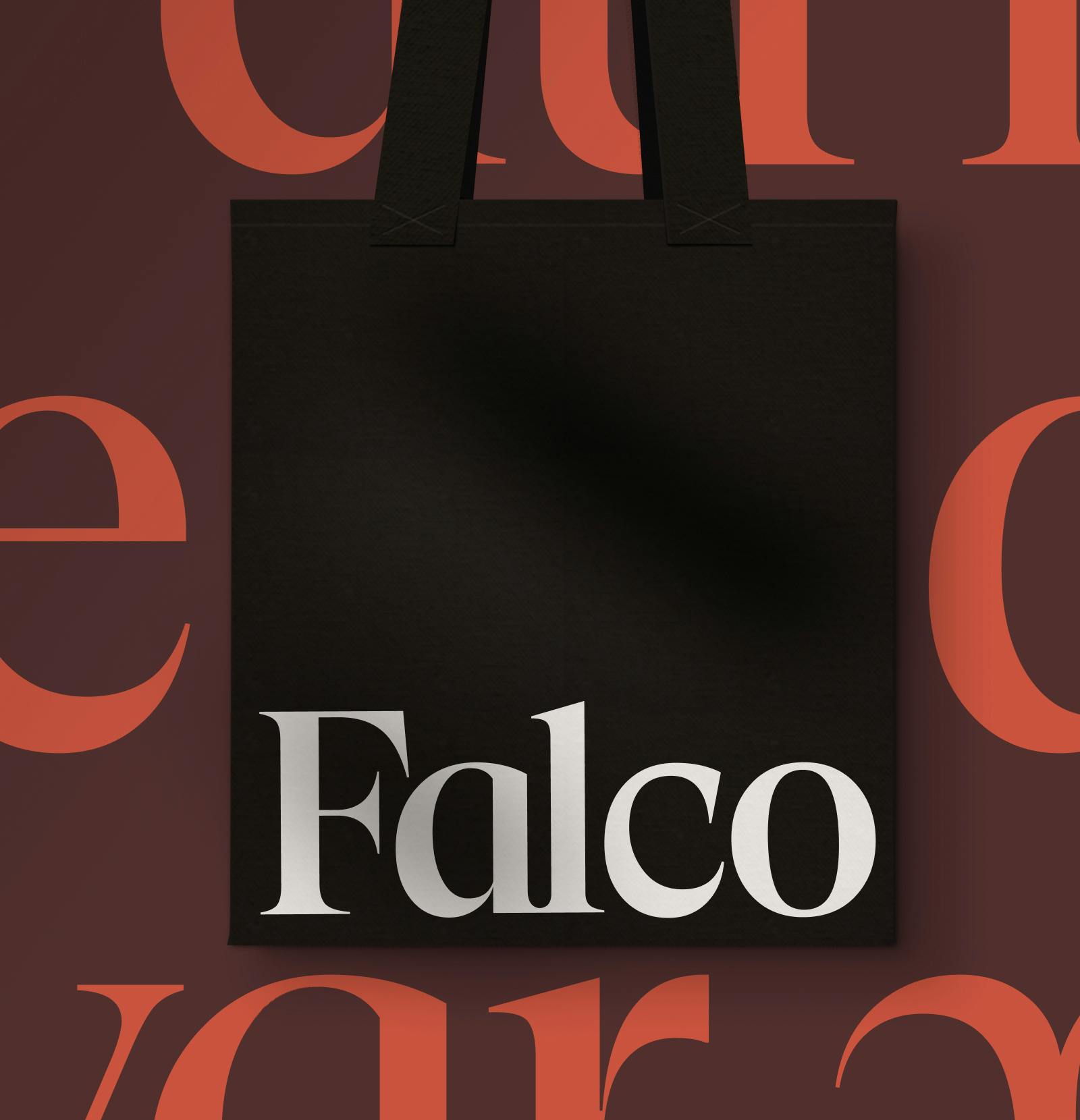
We went with GT Super Display for our brand. Chosen because of its distinct serif features. They almost look like a falcon’s claws catching its prey. Smart yet dangerous at the same time.
GT Super display is the result of an extensive investigation into display serif typefaces from the 1970s and 80s. It focuses on the expressive and idiosyncratic nature of calligraphic motions, compelled into stable, typographic shapes.
"Our visual identity makes it clear that we are a publishing house that is rooted in tradition, but looks towards new horizons. That we are a visionary and commercial publisher with high ambitions. It makes sure that we stand out and we've had a very positive response about it."

Anna Will
Publisher at Forlaget Falco


Anna Will
Publisher at Forlaget FalcoPeople
Other work

Scanomat
A Digital Universe for Coffee Lovers


